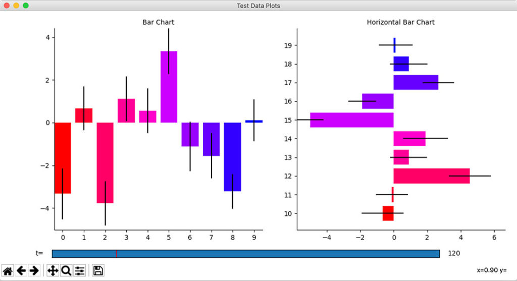
In today’s data-driven world, the ability to effectively communicate insights is paramount. Among the myriad of tools available, barcharts stand out as one of the most versatile and powerful forms of data visualization. From business analytics to academic research, barcharts offer a clear and intuitive way to convey information, enabling better decision-making and understanding. In this comprehensive guide, we will delve into the intricacies of barcharts, exploring their uses, design principles, creation techniques, and real-world applications.
Understanding Barcharts
At its core, a barchart is a graphical representation of data in which bars of varying lengths are used to illustrate numerical values. This visual format allows viewers to quickly compare different categories or datasets, making it ideal for presenting trends, patterns, and comparisons. Barcharts come in various forms, including vertical, horizontal, stacked, and grouped, each suited to different types of data and analytical objectives.
Barcharts are particularly effective for displaying categorical data or comparing multiple sets of data. For example, in a sales report, a vertical barchart could be used to visualize the revenue generated by different product categories over a specific time period. Similarly, a horizontal barchart might be employed to compare the performance of different sales teams within an organization. By presenting data in this manner, complex information becomes more accessible and actionable for stakeholders.
When to Use Barcharts
Knowing when to use a barchart is just as important as understanding how to create one. Barcharts are most appropriate when working with discrete categories or when comparing values across multiple groups. They excel in situations where clarity and simplicity are paramount, allowing viewers to easily grasp the underlying trends or relationships within the data.
One of the key advantages of barcharts is their ability to facilitate quick and accurate comparisons. Unlike other forms of data visualization, such as pie charts or line graphs, barcharts provide a clear visual representation of the relative sizes or magnitudes of different categories. This makes them particularly well-suited for highlighting trends over time, identifying outliers, or comparing the performance of different entities.
Designing Effective Barcharts
While barcharts are inherently simple in concept, designing them effectively requires careful attention to detail. Elements such as color choice, labeling, and axis scaling can significantly impact the clarity and interpretability of the chart. When designing a barchart, it’s essential to consider the audience and the intended message, ensuring that the visualization enhances understanding rather than obscuring it.
A common mistake in barchart design is the misuse of color. While color can be a powerful tool for highlighting key points or distinguishing between categories, it should be used sparingly and purposefully. Too many colors can overwhelm the viewer and detract from the overall effectiveness of the chart. Similarly, excessive gridlines or unnecessary embellishments can clutter the chart, making it difficult to interpret.
Creating Barcharts with Software Tools
In the digital age, creating barcharts has never been easier thanks to a plethora of software tools and platforms available. From spreadsheet programs like Excel and Google Sheets to specialized data visualization tools like Tableau and Python libraries like Matplotlib and Seaborn, there’s no shortage of options for creating professional-quality barcharts. Each tool has its strengths and weaknesses, so it’s essential to choose the one that best suits your needs and skill level.
For beginners, Excel and Google Sheets offer a user-friendly interface and a wide range of charting options, making them ideal for simple barcharts or basic data analysis tasks. More advanced users may prefer the flexibility and customization options offered by Tableau or Python libraries, allowing for more complex visualizations and integration with other data analysis workflows.
Advanced Barchart Techniques
Once you’ve mastered the basics of barchart creation, you can explore more advanced techniques to take your visualizations to the next level. Interactive barcharts, for example, allow viewers to explore the data in more detail by hovering over or clicking on individual bars to reveal additional information. Tools like D3.js and Plotly make it easy to add interactive elements to your barcharts, enhancing engagement and interactivity.
Another advanced technique is the integration of dynamic data sources, allowing your barcharts to update automatically as new data becomes available. This can be particularly useful in scenarios where real-time or streaming data is being monitored, such as in financial markets or social media analytics. By linking your barcharts directly to live data sources, you can ensure that your visualizations are always up-to-date and accurate.
Real-World Applications of Barcharts
The versatility of barcharts makes them invaluable in a wide range of industries and applications. In business analytics, barcharts are commonly used to track sales performance, visualize market trends, and monitor key performance indicators (KPIs). For example, a retail company might use a barchart to compare sales figures for different product categories over time, allowing managers to identify areas of strength and weakness.
In academic research, barcharts are often employed to present findings or illustrate trends in data analysis. Researchers might use a barchart to visualize the results of a survey or experiment, making it easier for readers to understand the implications of the study. Similarly, in publications and media, barcharts are frequently used in infographics, data visualizations, and data journalism to convey complex information in a clear and engaging manner.
Conclusion
In conclusion, barcharts are a versatile and powerful tool for visualizing data and communicating insights effectively. By understanding the principles of barchart design, knowing when to use them, and mastering the techniques for creating them, you can unlock the full potential of this timeless form of data visualization. Whether you’re a business analyst, researcher, or journalist, barcharts offer a simple yet powerful way to convey information and drive informed decision-making.


